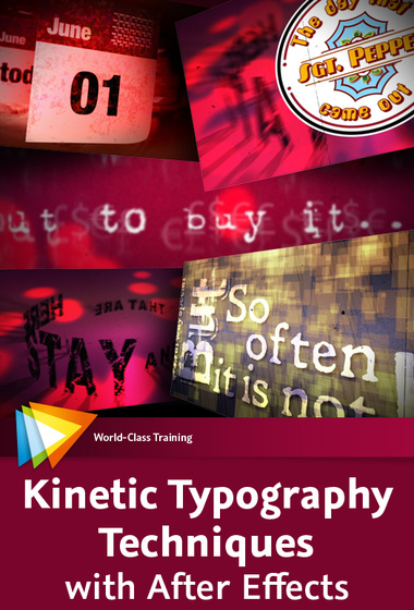
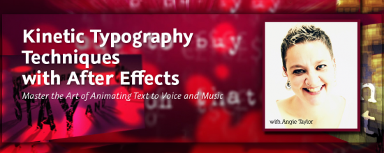
I was asked to create a workshop on Kinetic Typography techniques for Adobe After Effects by several people including the lovely people from video2brain who produced this epic workshop for me. I’d like to thank them all for their patience and professionalism throughout this long project!
I’m pleased to say that I have finally finished this epic workshop. It was originally planned as a one-hour tutorial but has developed into a full-on, eight-hour workshop covering all sorts of weird and wonderful techniques.
I started off by covering essential kinetic typography techniques such as automatically creating text layers by importing content from a text file – using Variables and Data Sets in Photoshop and Scripts in After Effects. I demonstrated how to format text, making use of typographic controls like Kerning and Baseline Shift to get creative with negative space. In the latter stages I applied some of the free Animation Presets, created and adapted complex text animators to help you understand how to control them.
While creating this piece I just couldn’t help but get creative and I slightly strayed away from the task in hand. As a result this workshop also includes techniques you may not immediately associate with traditional kinetic typography. In the included lessons we have fun animating and lighting layers in 3D space. We recreate an animated version of the Sgt. Pepper album cover using After Effects’ vector Shape Layers.
We even recreate an ancient stone circle from 3D text layers! You’ll also learn techniques for creating your own backgrounds, aged-film and dust and scratches effects by combining some of the built-in After Effects filters. Of course I also cover popular, requested techniques like animating handwriting on screen.
I use typography in my every-day work as a motion graphic designer but the artform of kinetic typography is different. The purpose of text in motion graphic design is to deliver a message. Generally, the text needs to be legible and on screen for long enough for the viewer to read and there are several other “rules” that are sensible to apply to motion graphic design. Kinetic typography as an artform kicks those rules into touch.
My understanding of kinetic typography is that the words should be used to convey moods or feelings, they don’t need to be the message, they are just there to support it. My feeling is that the words should echo the spoken words rather than simply repeat what’s being said.
In my interpretation of Richard Walkers “That Day” (a poem set to music) I wanted to portray what I took personally from the piece. I understood it to be about the dissatisfaction we have with the present moment and how we avoid enjoying it by always thinking about the past or the future. This avoidance leads to confusion, frustration and general unsettled feelings.
In this workshop you get all my project files along with my creative musings about how these ideas developed. I hope that you can enjoy working on some of my own files and diving into my own personal creative project. Here are some sample movies from the workshop to give you an idea about what you can learn.

Leave a Reply
You must be logged in to post a comment.