– a typography video-training workshop on the principles of designing text.
 I’ve just finished recording my latest workshop with the fantastic team at video2brain. It’s a workshop with a difference.
If you want the salient points delivered to you quickly so you can get on with your work, this product is perfect for you. It’s a series of short videos that form an educational and enjoyable workshop that you can sit back and enjoy – imbibing my knowledge as you go!
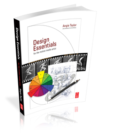
It’s based upon the Typography chapter from my book, Design Essentials for the Motion Media Artist. Not everyone likes to read books or needs the level of detail covered in Design Essentials so this provides an alternative.
It provides a quick-reference guide in the format of a video presentation. All the essential key principles of Typography that every designer needs are covered. And it won’t bog you down with too much detail (that’s what the book is for right?) it’s fast-paced and illustrated throughout with helpful animated diagrams and examples of work.
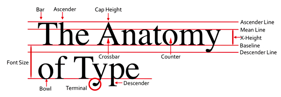
Learn about the history and anatomy of type as well as the terminology used to describe the components of text. Discover the difference between typefaces and fonts, glyphs and characters, serifs and sans serifs, kerning and tracking, leading and baseline shift. Find out when and why you would use specific fonts based on aesthetics, cultural associations and characteristics.

This workshop expands on the content of the book with additional software exercises to improve your typographic software skills. You’ll learn how to apply the principles of typography in practical ways to graphic design projects. Software exercises will show you how Adobe’s Character and Paragraph panels can help make the most of your text, creating unique and exciting effects.

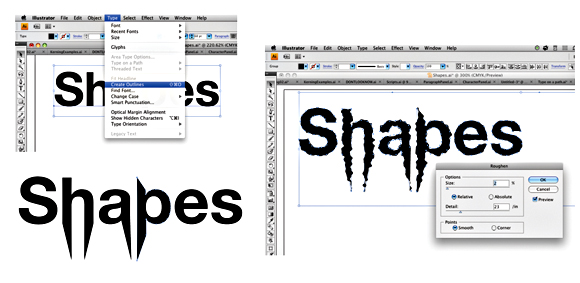
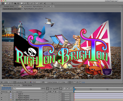
I’ll also teach you lots of neat tricks like animating text along paths in After Effects and making text write on the screen. In Illustrator we’ll use operators to customize lettering, giving it a hand drawn look,. We’ll create 3D Text in Photoshop and add Layer Styles to brighten up our graphic designs. In InDesign you’ll make the most of its powerful Open Type features such as ligatures, glyphs and other special characters.

With this comprehensive typography video training workshop you can simply sit back and watch as I present the principles for you. If you feel like following along, all the exercise files are provided. The videos are short and easily digested and you won’t get bogged down with technical jargon as I explain difficult concepts using easy-to-understand, real-world terminology.
If you’d like to be notifies when this title becomes available please click on this link.


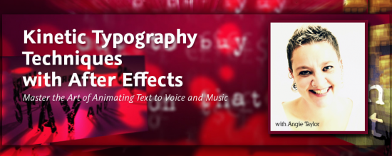
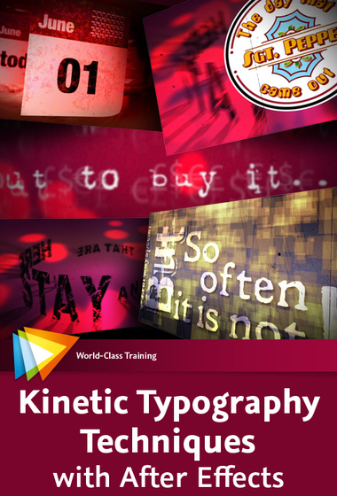
Kinetic Typography Techniques with After Effects

I was asked to create a workshop on Kinetic Typography techniques for Adobe After Effects by several people including the lovely people from video2brain who produced this epic workshop for me. I’d like to thank them all for their patience and professionalism throughout this long project!
I’m pleased to say that I have finally finished this epic workshop. It was originally planned as a one-hour tutorial but has developed into a full-on, eight-hour workshop covering all sorts of weird and wonderful techniques.
I started off by covering essential kinetic typography techniques such as automatically creating text layers by importing content from a text file – using Variables and Data Sets in Photoshop and Scripts in After Effects. I demonstrated how to format text, making use of typographic controls like Kerning and Baseline Shift to get creative with negative space. In the latter stages I applied some of the free Animation Presets, created and adapted complex text animators to help you understand how to control them.

"That Day" Music by Richard Walker
While creating this piece I just couldn’t help but get creative and I slightly strayed away from the task in hand. As a result this workshop also includes techniques you may not immediately associate with traditional kinetic typography. In the included lessons we have fun animating and lighting layers in 3D space. We recreate an animated version of the Sgt. Pepper album cover using After Effects’ vector Shape Layers.

Welcome Video

Introduction to Kinetic Typography
We even recreate an ancient stone circle from 3D text layers! You’ll also learn techniques for creating your own backgrounds, aged-film and dust and scratches effects by combining some of the built-in After Effects filters. Of course I also cover popular, requested techniques like animating handwriting on screen.
I use typography in my every-day work as a motion graphic designer but the artform of kinetic typography is different. The purpose of text in motion graphic design is to deliver a message. Generally, the text needs to be legible and on screen for long enough for the viewer to read and there are several other “rules” that are sensible to apply to motion graphic design. Kinetic typography as an artform kicks those rules into touch.

Editing and Looping Audio

Variables and Data Sets in Photoshop
My understanding of kinetic typography is that the words should be used to convey moods or feelings, they don’t need to be the message, they are just there to support it. My feeling is that the words should echo the spoken words rather than simply repeat what’s being said.
In my interpretation of Richard Walkers “That Day” (a poem set to music) I wanted to portray what I took personally from the piece. I understood it to be about the dissatisfaction we have with the present moment and how we avoid enjoying it by always thinking about the past or the future. This avoidance leads to confusion, frustration and general unsettled feelings.
In this workshop you get all my project files along with my creative musings about how these ideas developed. I hope that you can enjoy working on some of my own files and diving into my own personal creative project. Here are some sample movies from the workshop to give you an idea about what you can learn.

Aged Film with Turbulent Noise

Animate Handwriting with the Stroke effect

 I’ve just finished recording my latest workshop with the fantastic team at video2brain. It’s a workshop with a difference.
